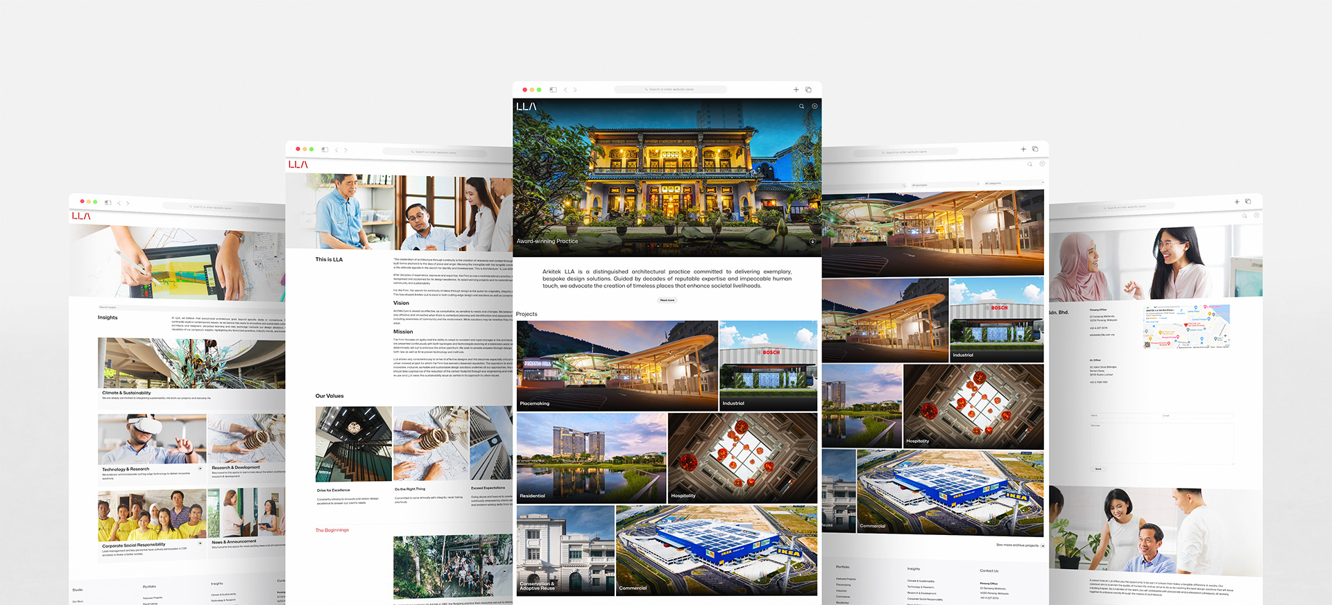
Branding Case Study
LLA
Crafting Structures . Uplifting Futures
A New Era of Architectural Excellence
In the ever-growing world of architecture, maintaining relevance while staying true to one’s identity is an essential yet challenging thing to do. For over four decades, Arkitek LLA has remained one of the top firms within the architectural landscape of Penang, known for its remarkable design solutions and unwavering commitment to quality. However, in an era marked by evolving advancements and sensibilities, the firm recognised the need for a change. Thus, with our assistance, Arkitek LLA embarked on a journey with us to redefine its brand identity.
SCOPE OF WORK
Brand Refresh
Brand Strategy
Brand Identity
Brand Development
Brand
Consultancy
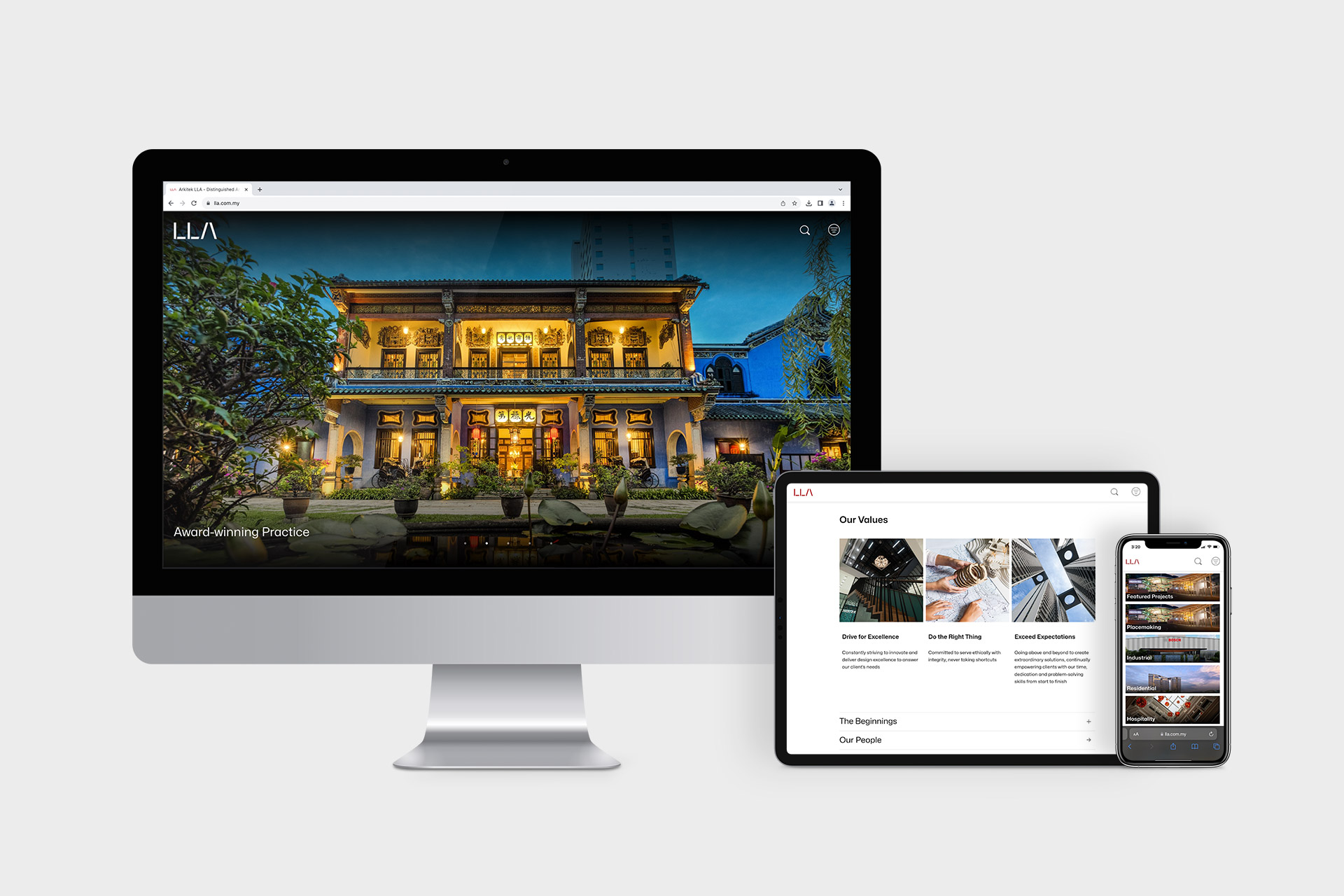
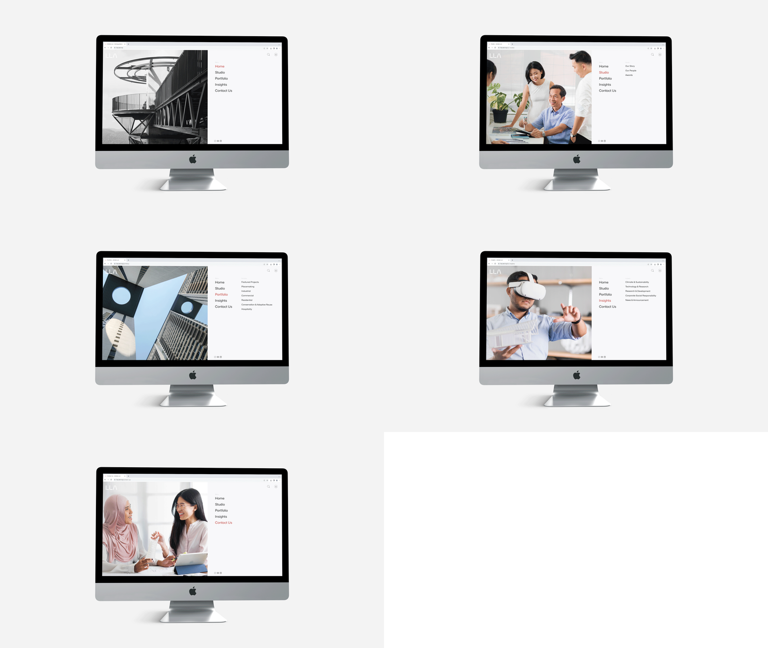
Website Design
Photgraphy
Collaboration was at the core of our approach. At the preliminary stage, we were actively engaged in extensive discussions with the firm to understand their principles, aspirations, and essence. This collaboration facilitated our task of incorporating their insights into our refresh while imbuing our creativity throughout the process.
The journey towards building Arkitek LLA’s new identity was an extensive and ambitious one, as it involved a deep dive into their robust history and portfolio. But we are always up for a challenge, and after months of working on the project, we managed to craft a new brand identity that encapsulates the firm’s essence, all done in a fresh, contemporary look.
Our first step was the verbal identity. Working based on the firm’s prior brand research, we translated their key communication elements into a consistent messaging framework that would effectively convey the brand’s vision to both their existing and potential clients. Additionally, the refresh included a minor yet impactful change in the firm’s name. The switch from Arkitek LLA to LLA is a pivotal part of the brand refresh. This transition was inspired by our collective vision to embrace a sleeker identity that would align and resonate with modern society. Without forgoing the legacy of the practice, the new name gravitates towards a more contemporary direction, facilitating its future expansion into wider international markets.
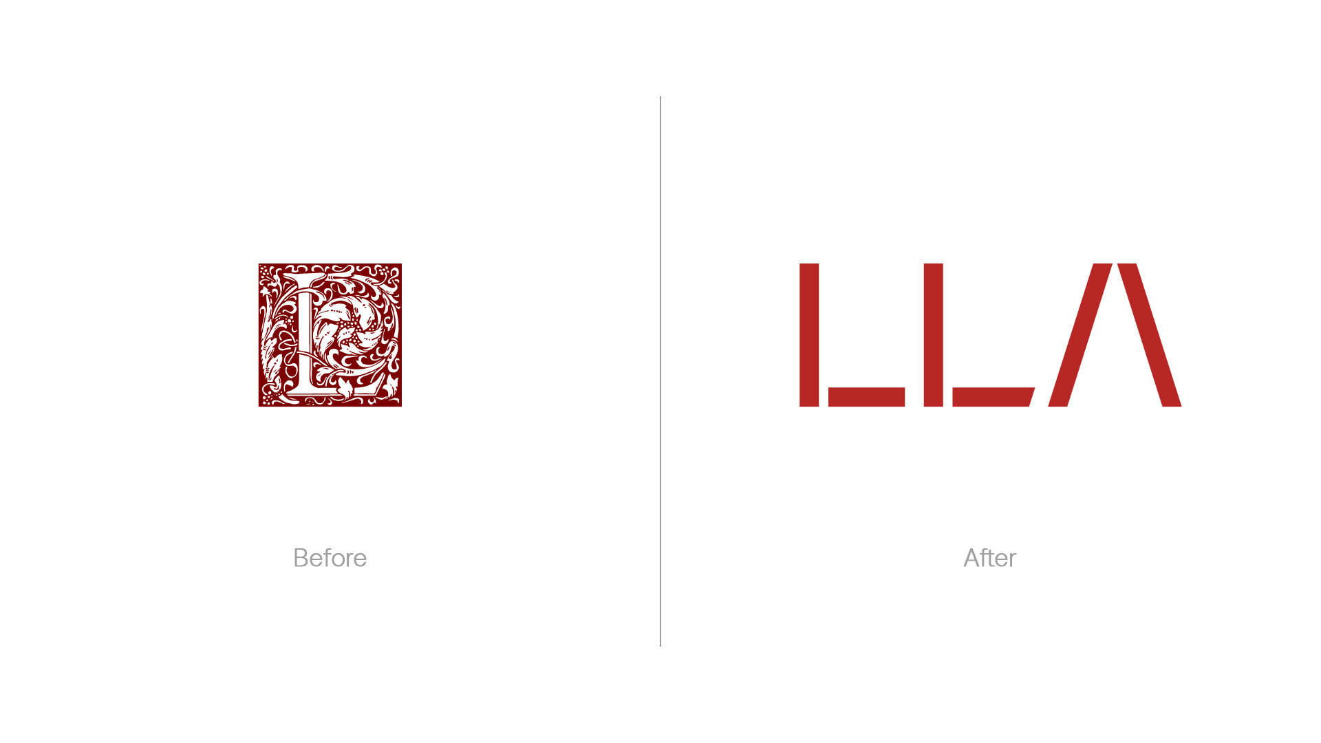
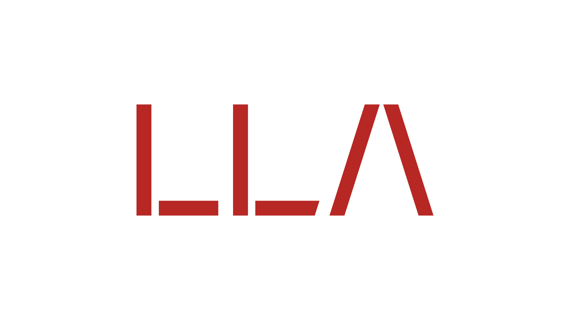
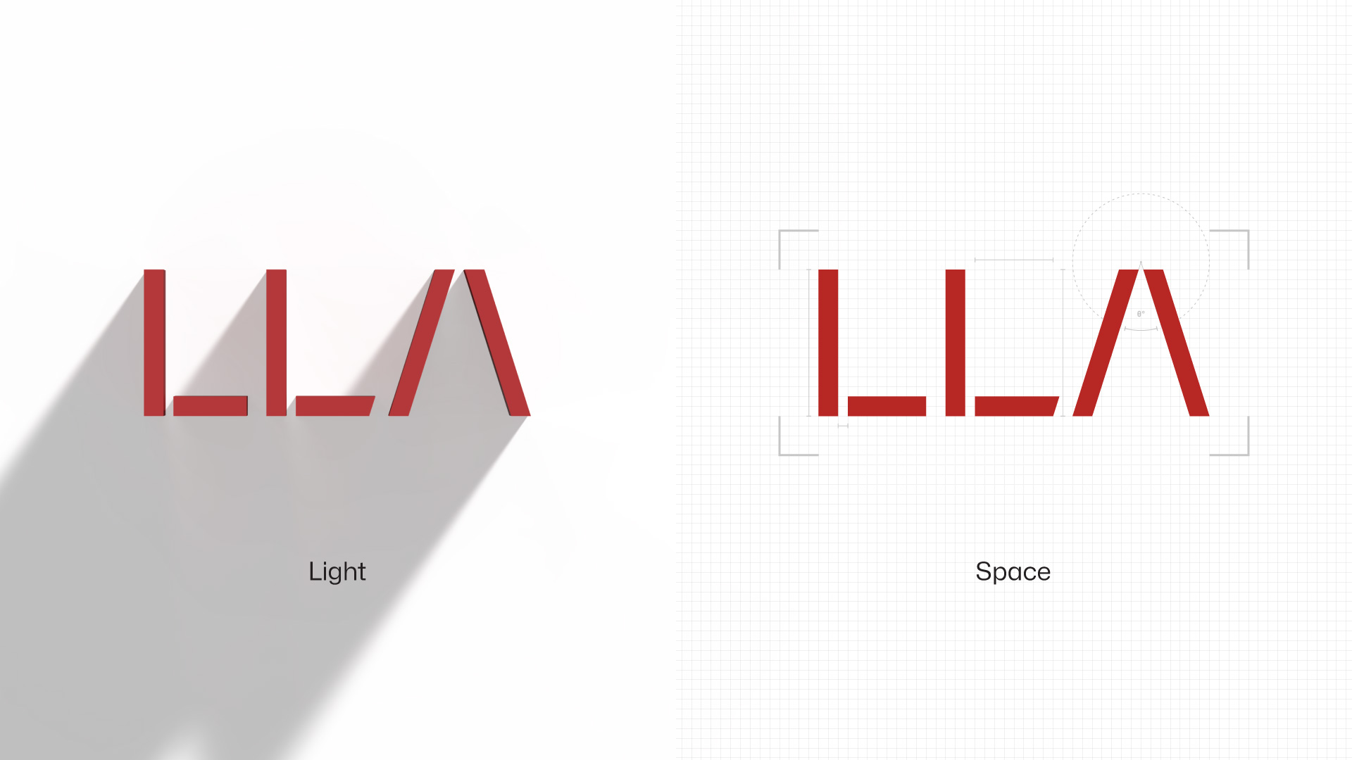
"Inspired by architectural blueprints and drawings, the refreshed logo accentuates two fundamental elements of the practice - space and light."
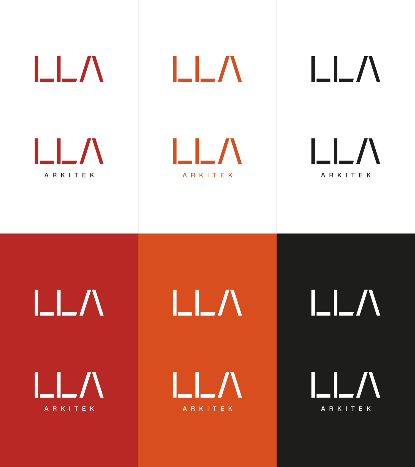
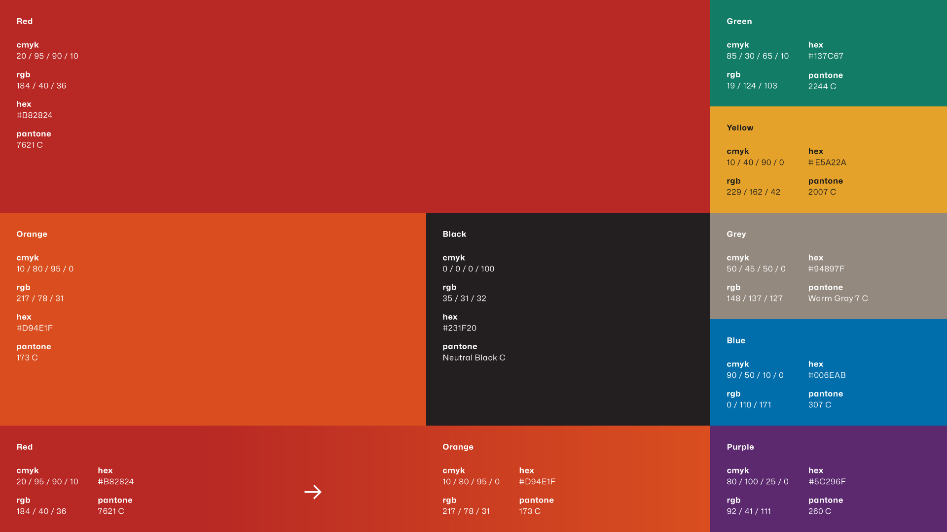
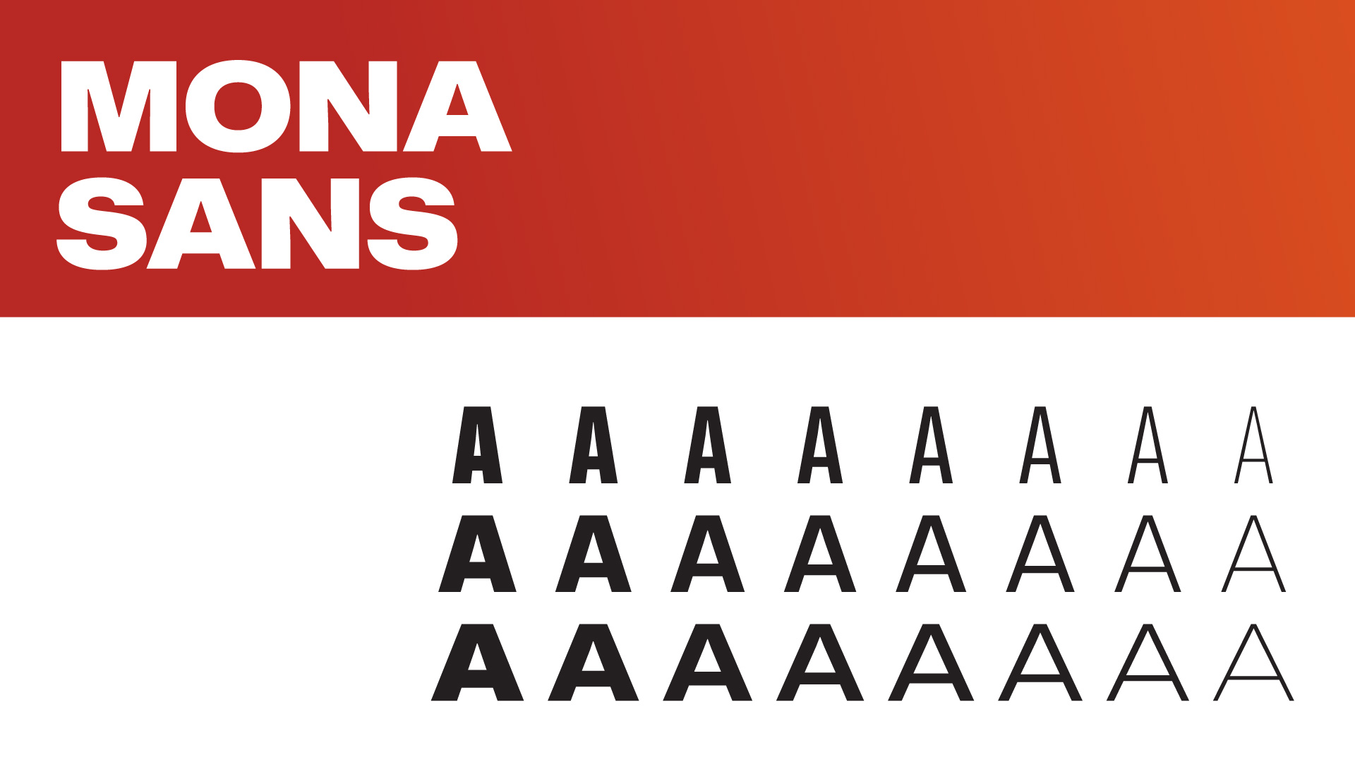
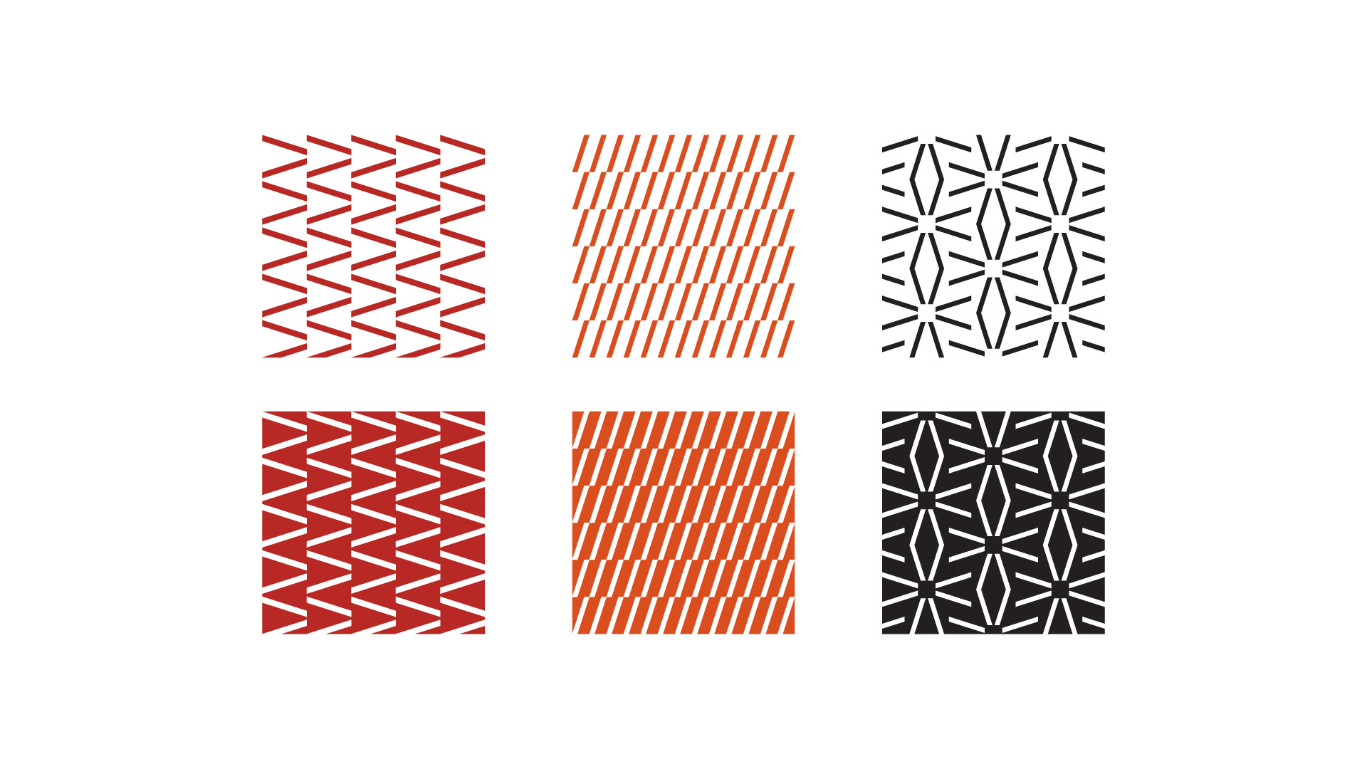


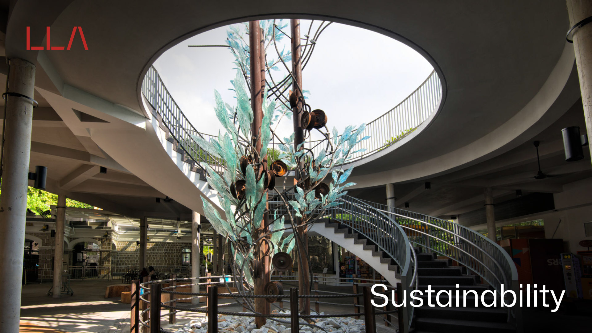
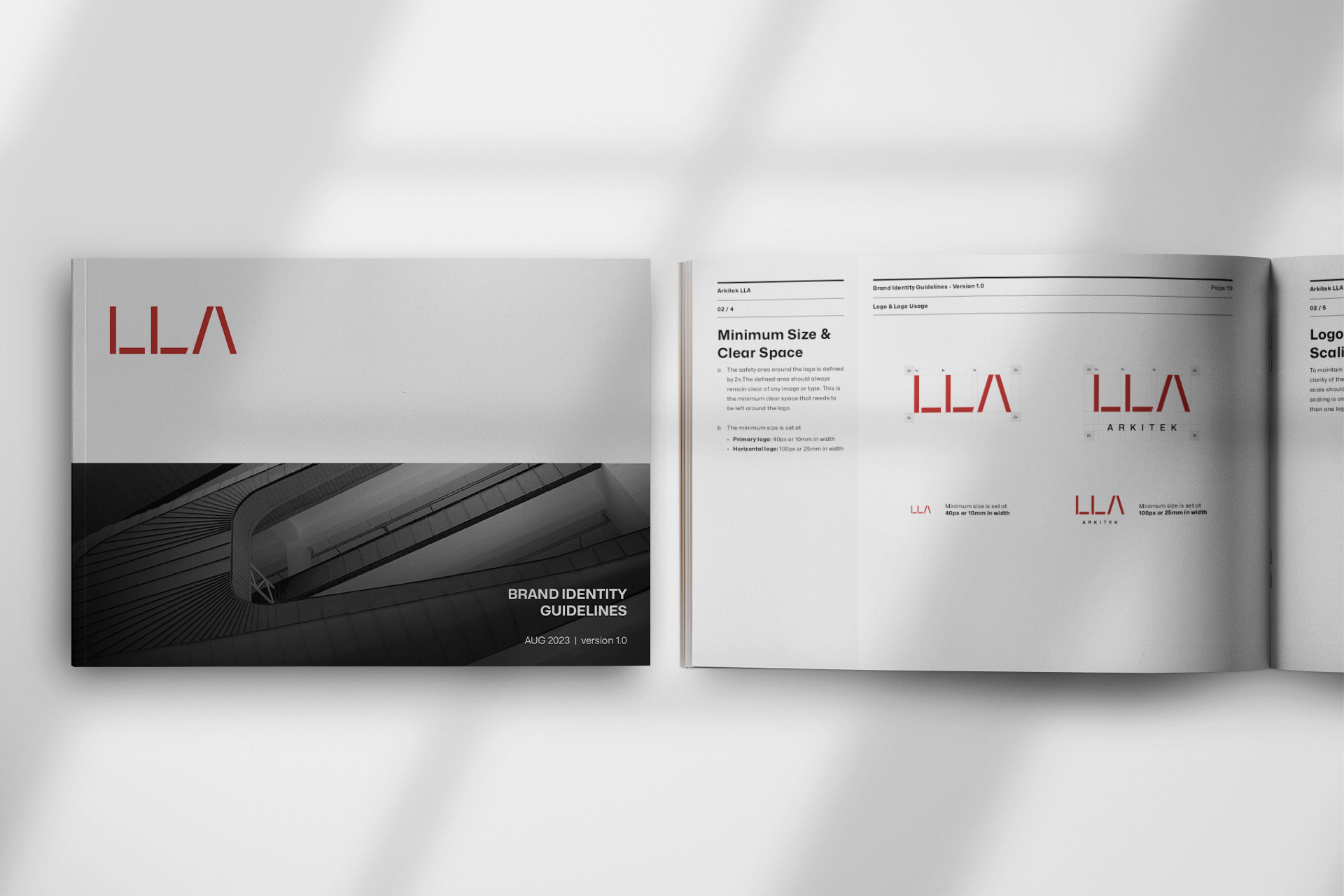
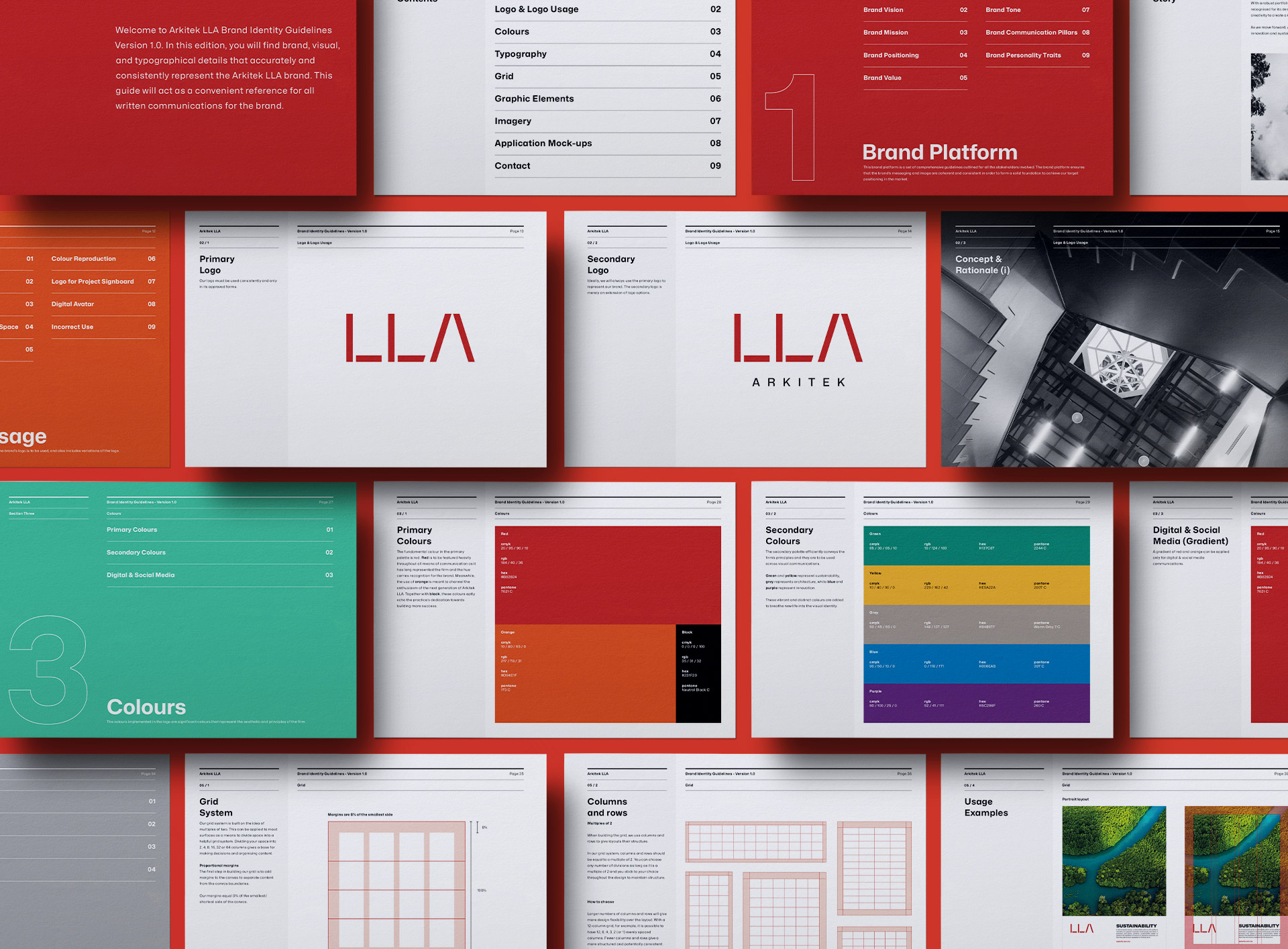
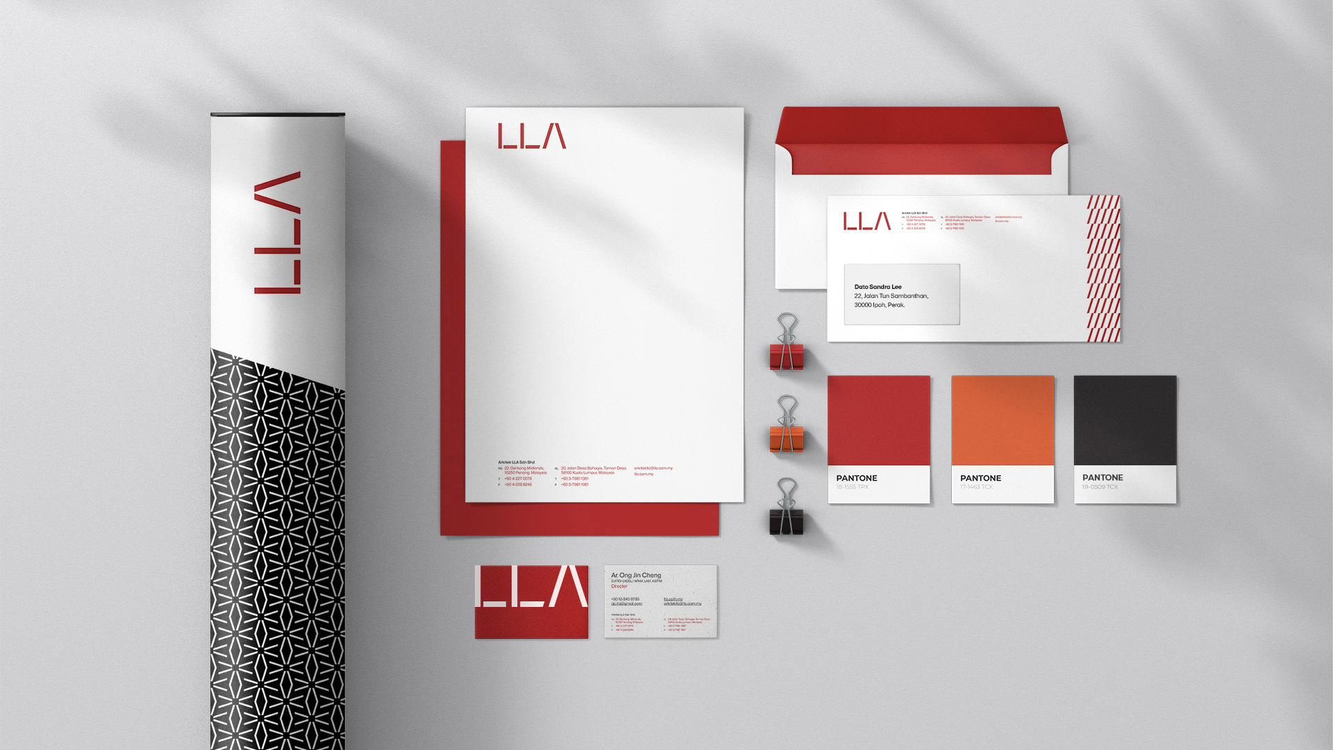
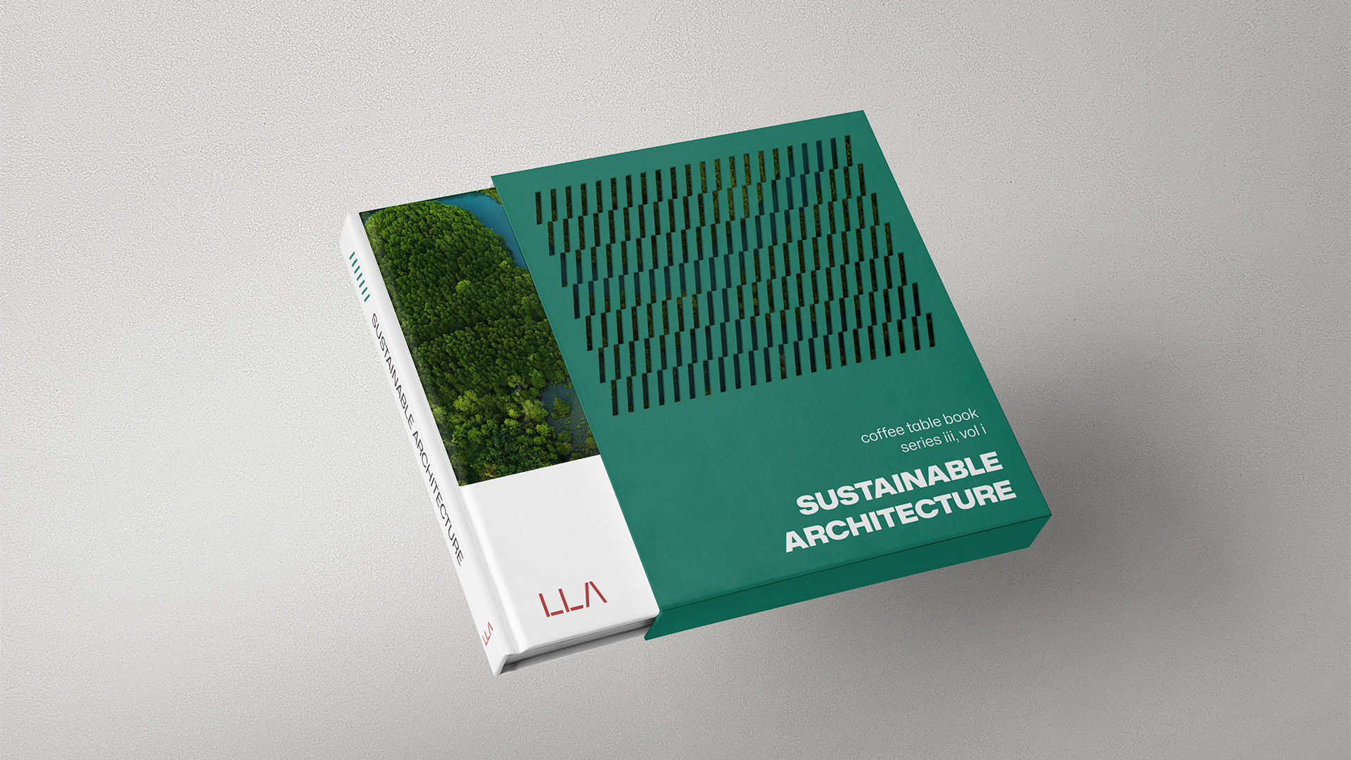
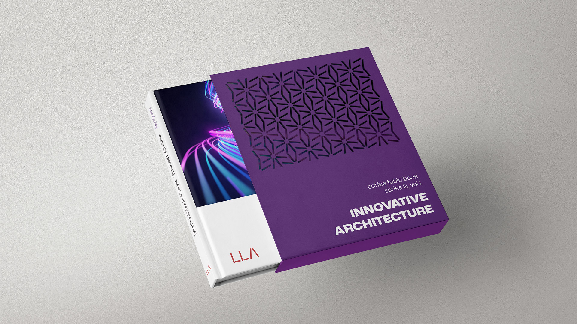
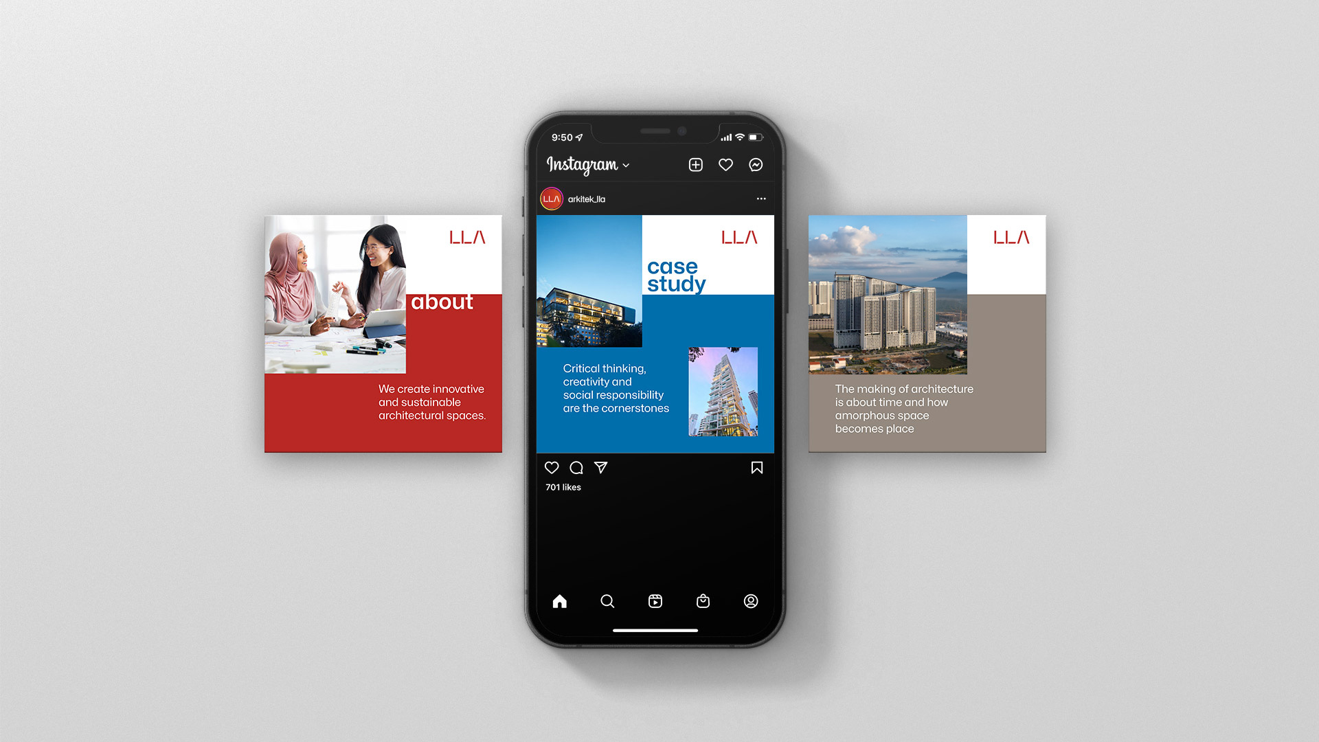
To complement the verbal identity, we also undertook the task of revamping the logo as well as creating a series of visual identity elements. While significantly different from the original, the logo still retains all the essences of the firm and architecture in general. Inspired by architectural blueprints and drawings, the refreshed logo accentuates two fundamental elements of the practice - space and light. We also upgraded LLA’s colour palette by adding a secondary palette and added new visual elements to breathe new life and enhance brand visibility.
