BIG NUTS
Creative Packaging
Big Things Come in Small Packages
Conventional, bulky packaging can be a setback for brands as the demand for food packaging has shifted due to the nature of the younger generation who prioritise convenience and are constantly on-the-go. So, to cater to this problem, we created a series of packaging designs to wrap up Big Nüts’ rebranding exercise.
SERVICES PROVIDED
Product Packaging Design
A Splash of Colour
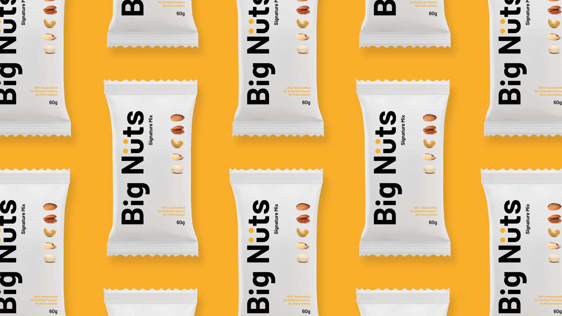
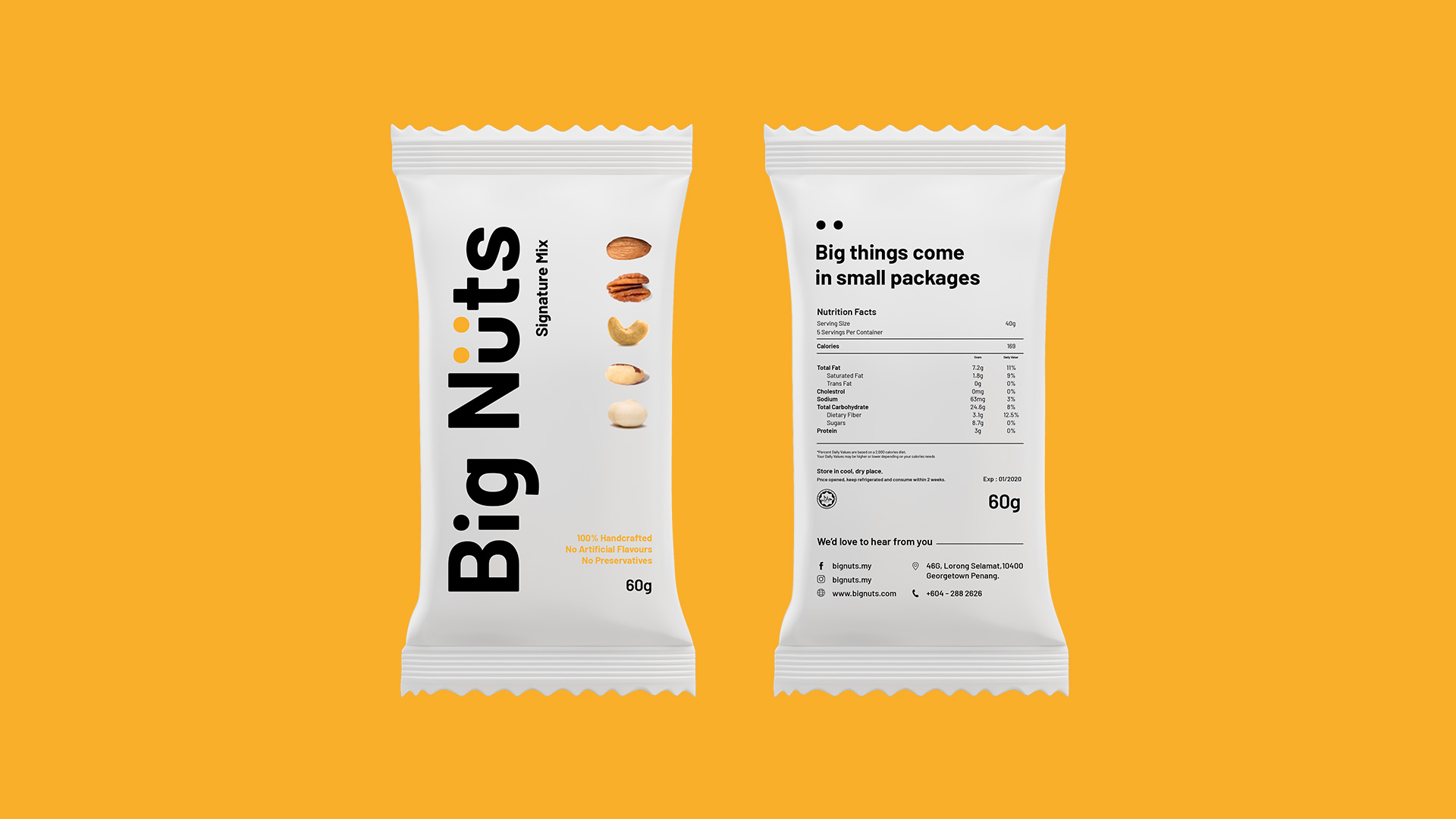
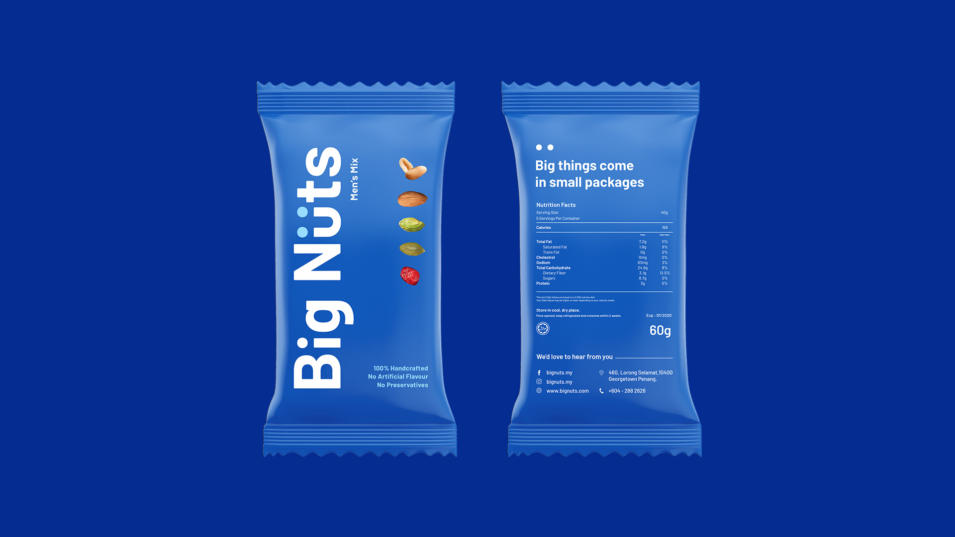
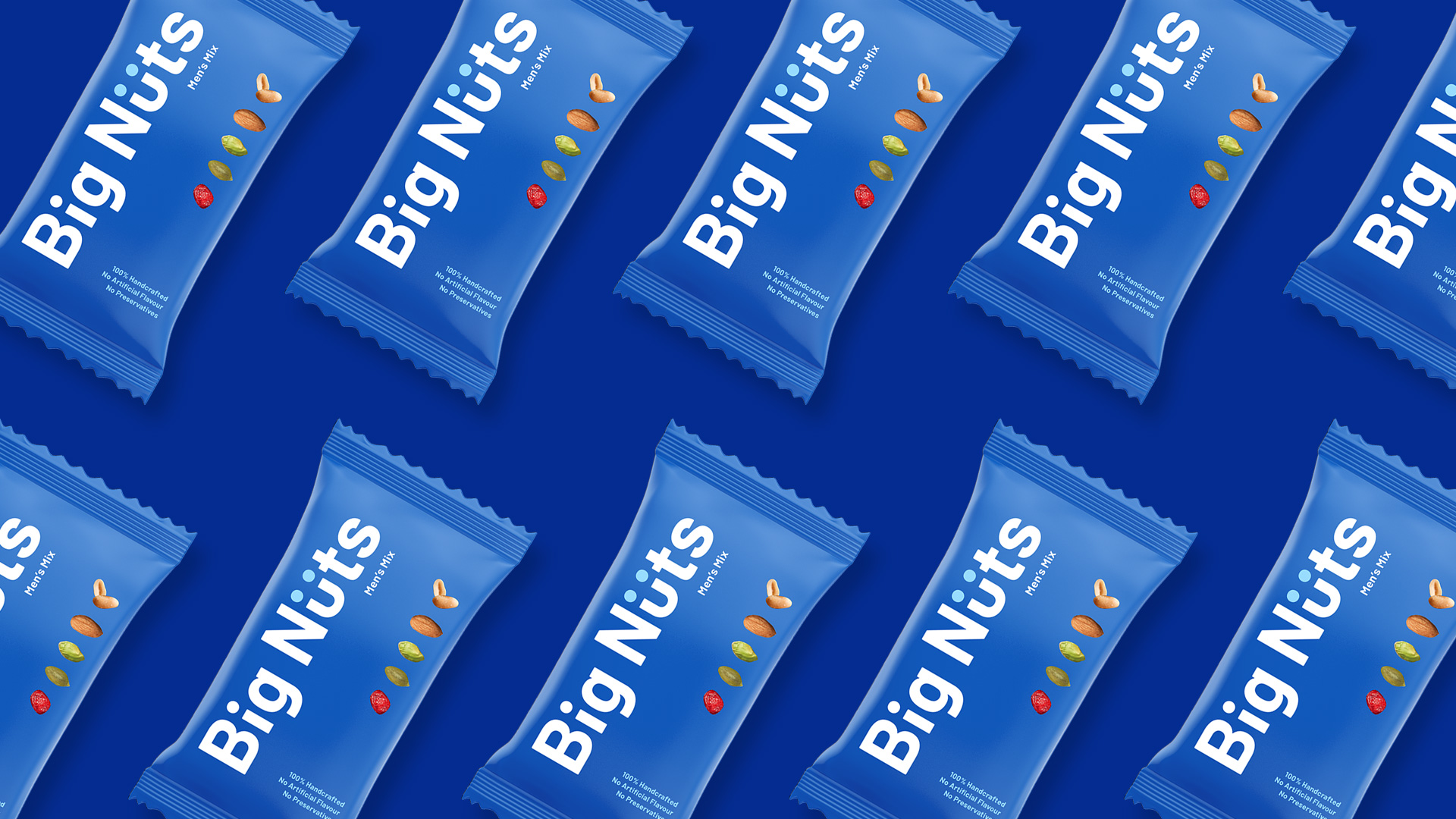
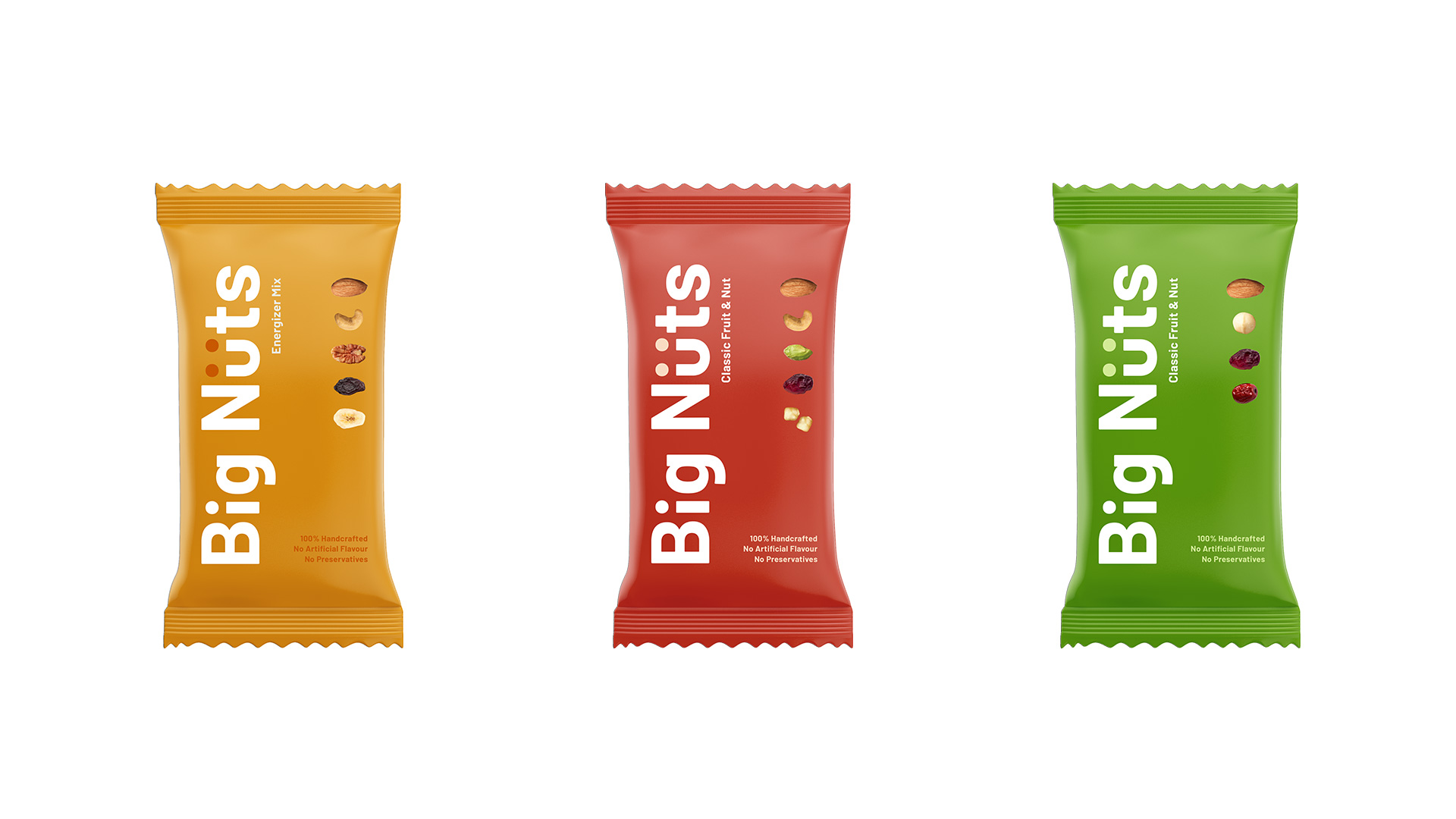
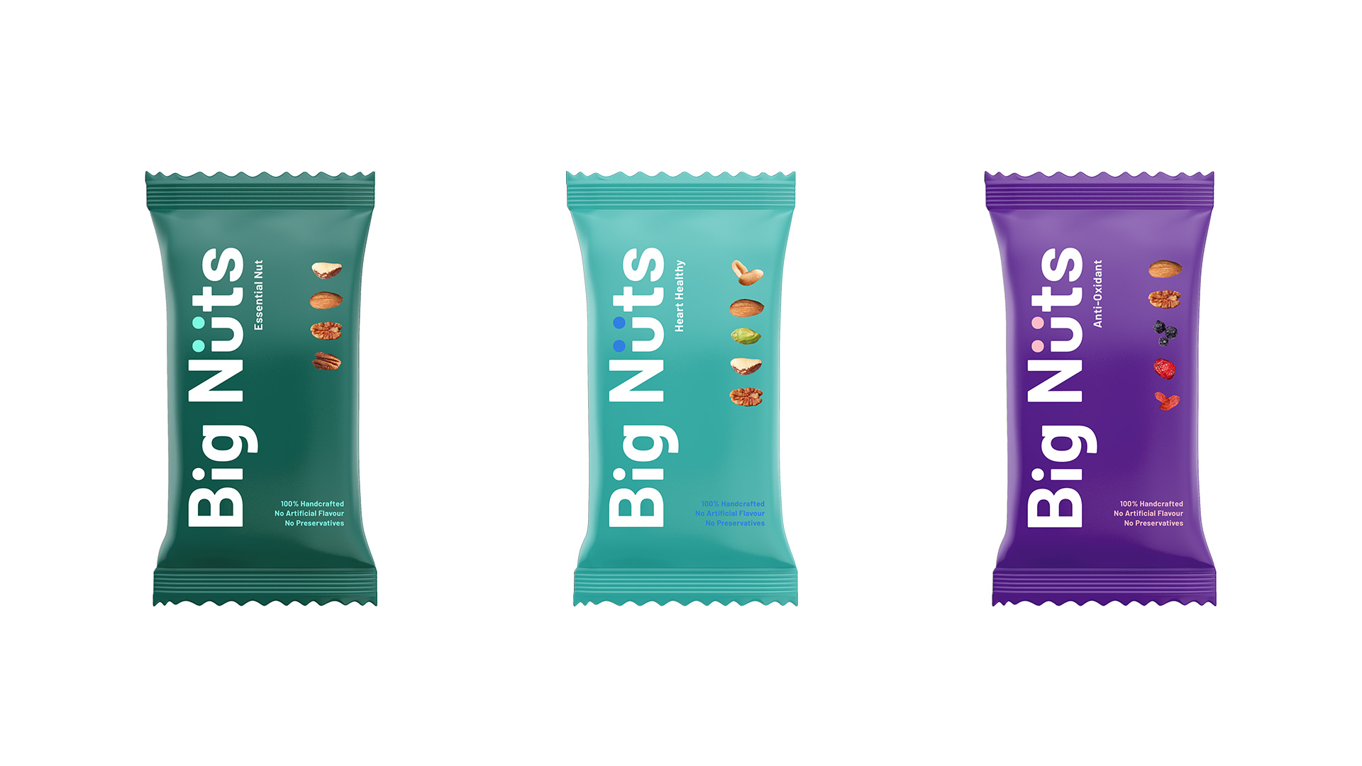
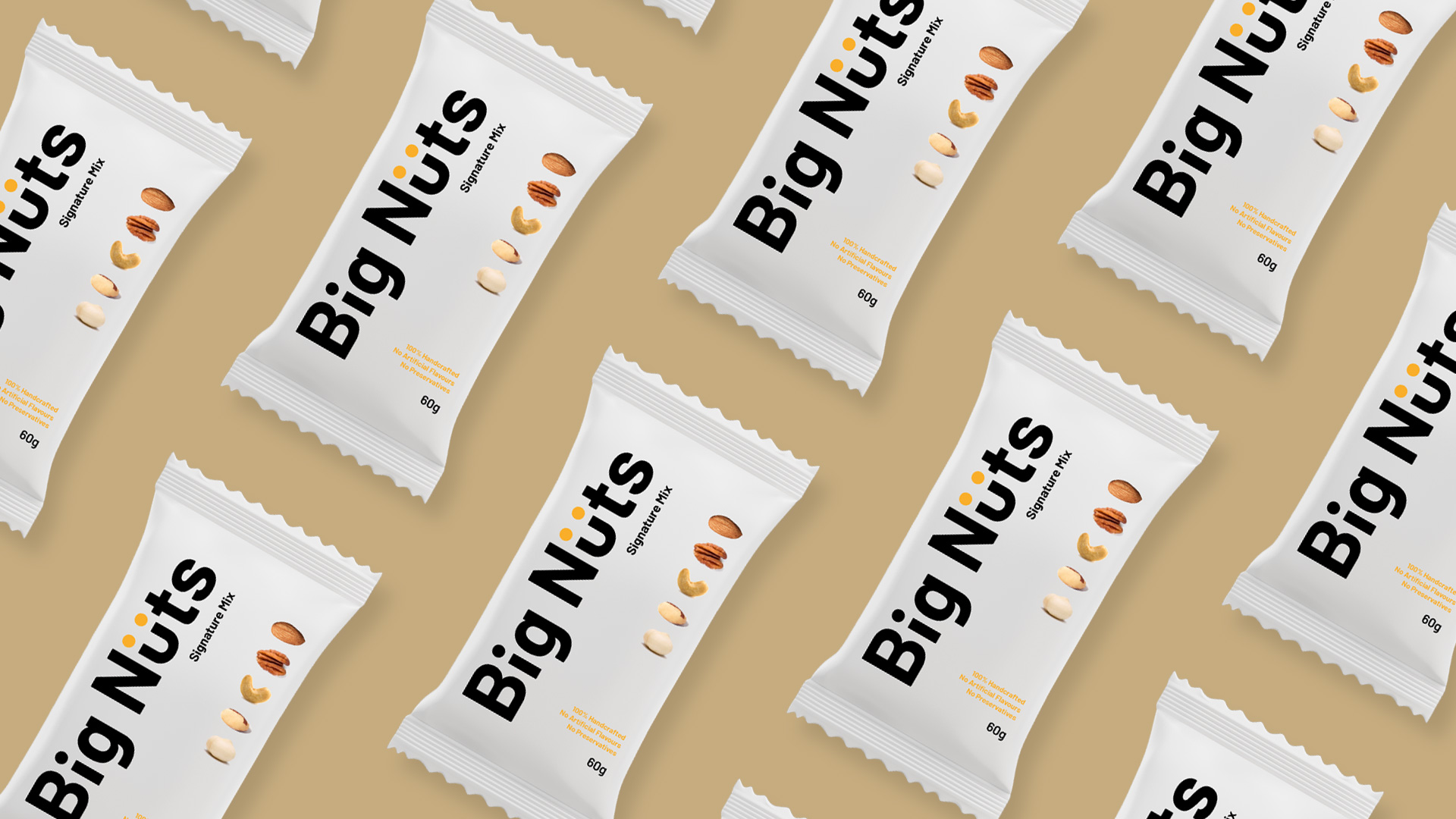
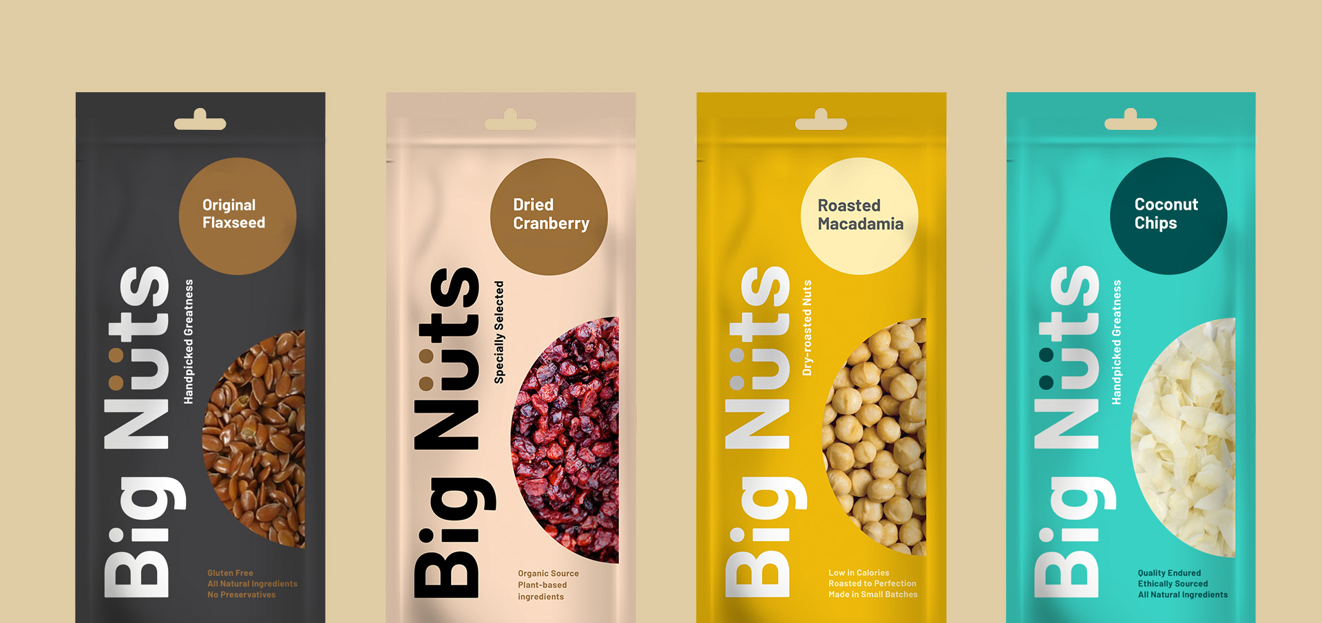
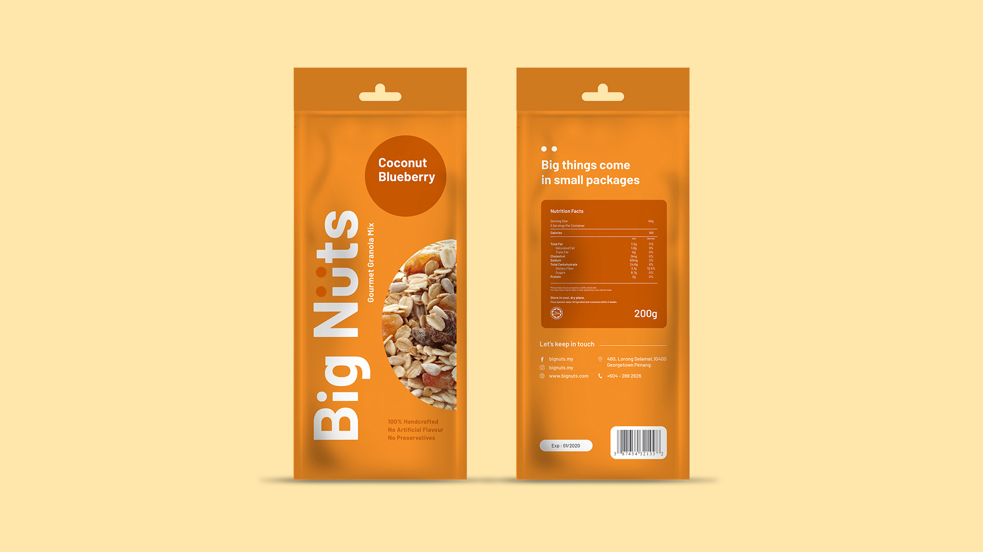
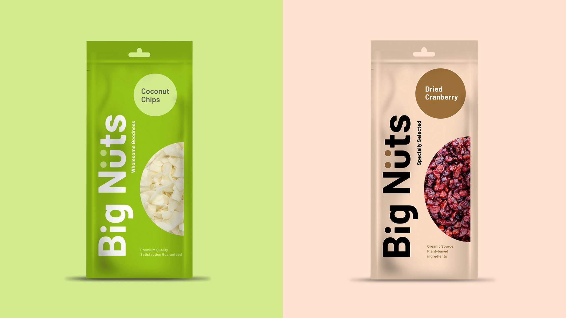
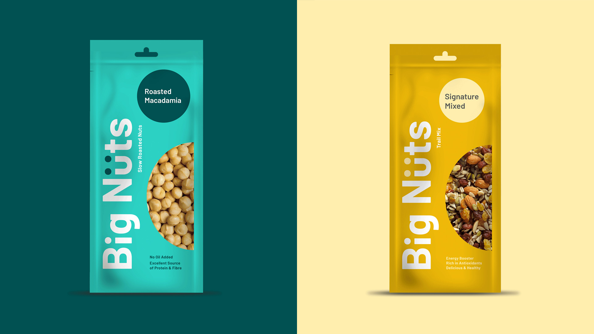
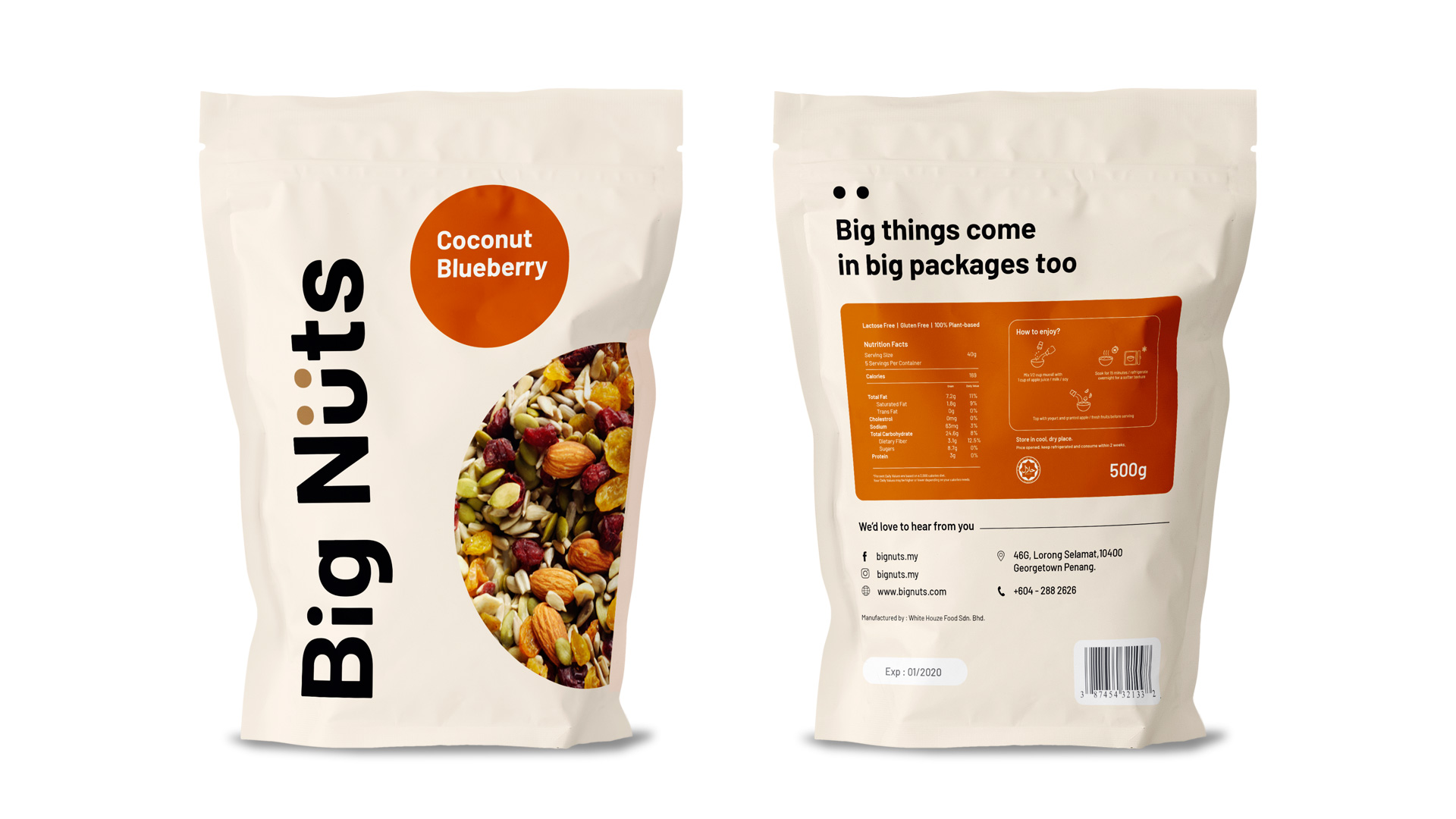
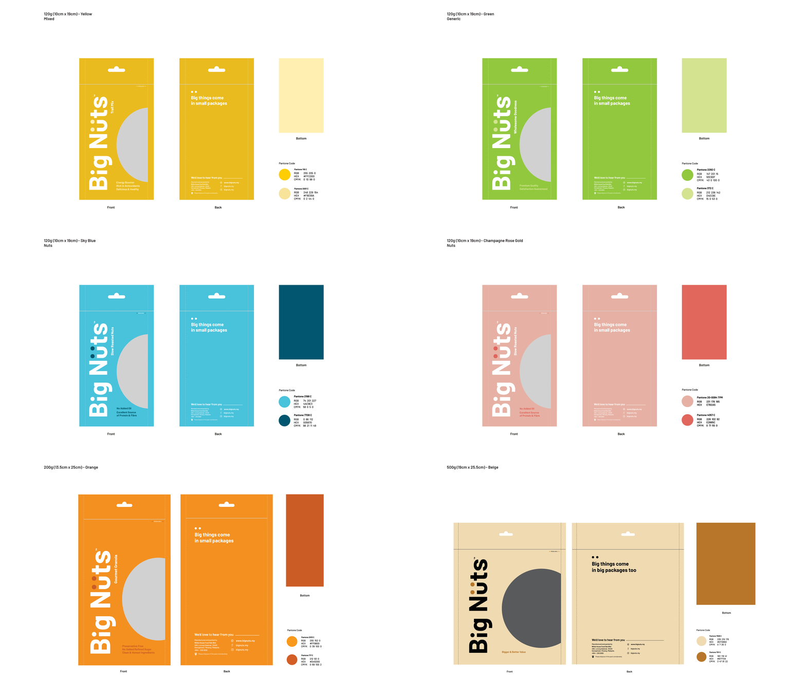
To resonate with the younger generation, we needed to step up our packaging game. By using the right language and colour, we got to create a vibrant visual experience that goes well with Big Nüts’ target audience while simultaneously showcasing their unique personality. We came up with a series of packaging featuring different sizes to cater different functionalities - a 500g for bulk purchases and a 200g window-infused packaging that reveals the nuts inside for shelving. Made with consumer’s convenience in mind, we also created a separate series of packaging to feature practicality and simplicity for a handy and ready-to-go concept as part of the brand’s expansion. The diverse colourful packaging also came with small, round stickers made up of different colours to indicate their different range of products.
Embracing Minimalism and Convenience
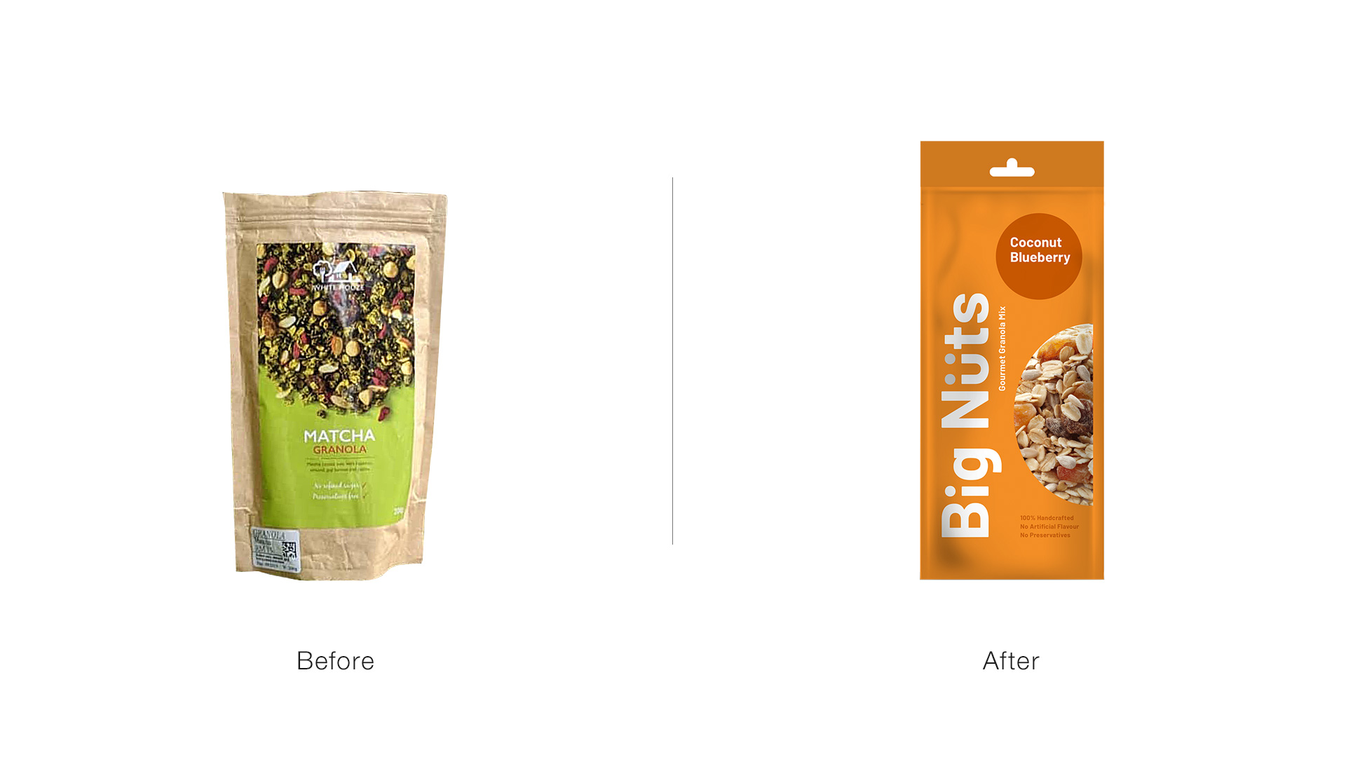
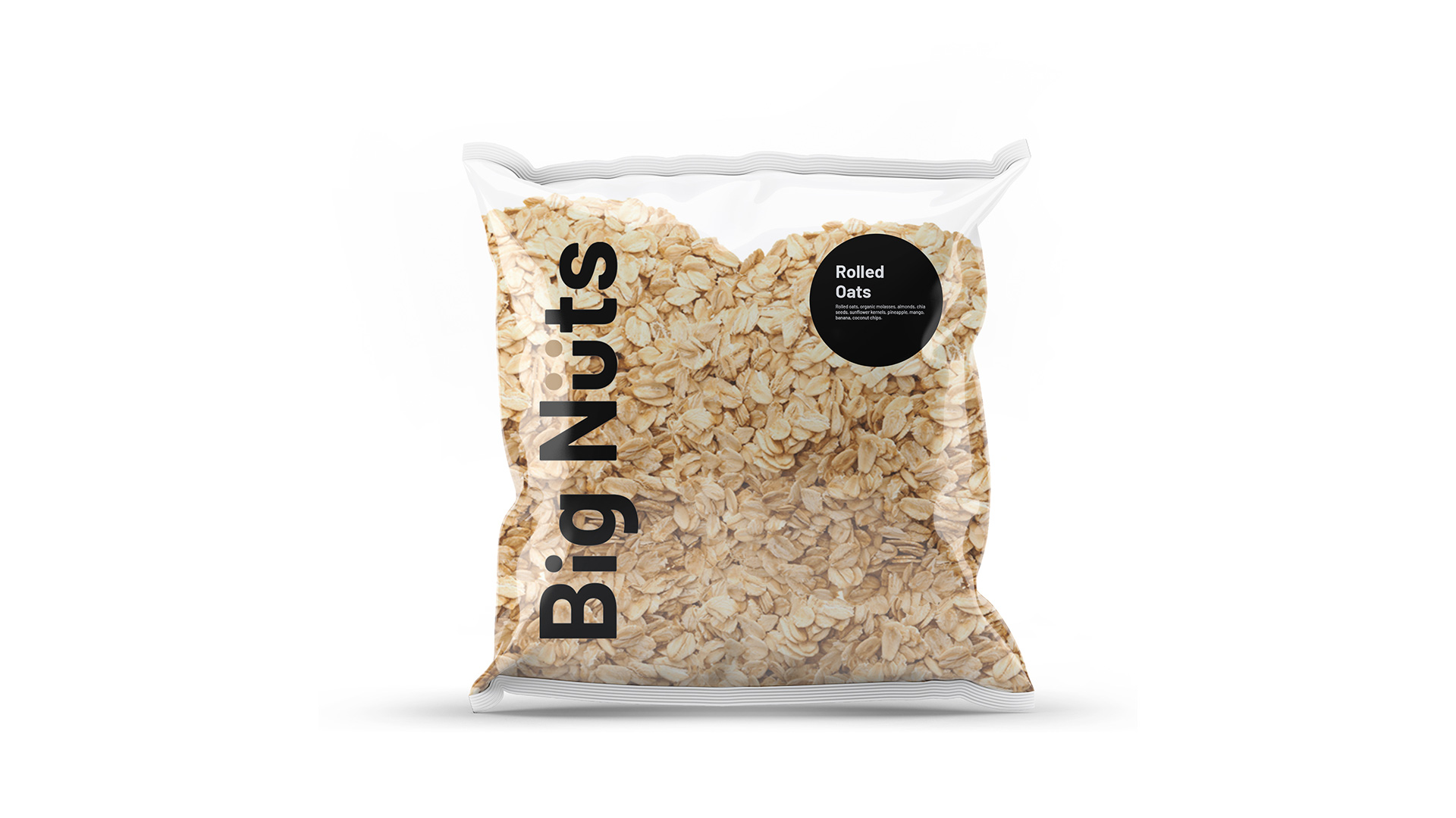
Our execution was effective in reinforcing Big Nüts’ fun, new personality and convenience that millennials seek. Our creation of fun, smaller packaging was also considered a first mover which subsequently led to a rise of similar packaging in the market. The clean and half clear packaging allowed buyers to assess the freshness and quality of Big Nüts’ goods. This transparency echoes the founders’ mission to promote and make clean eating accessible.
What our client say
“It was an eye-opening experience working with such a creative team as we would never realise how packaging places an important cue on our brand.”
Jason & Chris
Big Nüts Founders
